Tuesday, March 31, 2026

Table of Contents

So this is where everything changed essentially. We all know that I didn't have the best shooting day... So that drastically effected the amount of photos I was able to use and the amount of photos that I had. Which in effect, caused me to have an epiphany. The table of contents that I had previously selected require a lot of photos.

Original TOC:


Used a lot of photos that I didn't have...


So instead I went researching to look for a different table of contents idea. Panicking and in a rush because the deadline was soon, I went with the option that required the least amount of photos. And I found it!

Yes I know it looks bad and blan, but this was the format I was going for and I knew if I could put my own spin on it, I'd be able to make a semi decent looking table of contents.

Link for image: https://bmorejon.weebly.com/blog-posts/26-the-construction-of-the-table-of-contents


The next step was actually creating the table of contents, not doing all the editing and designing stuff. But more of what pages I'm going to have, how many pages, how many subheadings, and things like that.

So I figured out a few things:

  • I wanted to have the word "contents" instead of "Table of Contents."
  • I want a section somewhere on the page labeled "Recipe of the Week," which I will be promoting the cover dish "Creamy Garlic Chicken & Potatoes" and providing a brief description of the dish
  • I also wanted a separate section for all the feature stories/articles in my magazine
  • And I wanted there to be around 70 pages total with around 6 subheadings
  • And lastly, I decided to use 3 images (totally not because those were the only ones I had left)... :(

And now, after all the planning, I was finally set and ready to start designing and bringing this beautiful table of contents to life!!!


Tuesday, March 24, 2026

Cover Page Final

So after a few days and a heartbreak (my entire indesign project for my cover deleted...) I finally have completed my cover page for my magazine and I am happy with the results.

In the last blog, this is what my magazine looked like:


It was good yes, but it was very incomplete, I wasn't happy or satisfied with the work that I had done and knew that I had to do more. Like for example, looking at that page you see a lot of blank space on the cover. On the left hand side, in the bottom right, I felt like there wasn't enough to look at even though I was going for that "minimalist" style.

So what I did was add pieces of text where the magazine was empty. For the left hand side this is what I added:


It's something simple and very modern. Where we see the phrase "Meal Prep Made Easy" to add that welcoming feel to the viewer who may be on the fence of commiting to the journey of meal prepping. I added a orange line underneath just to separate the main subheading and the rest of the list underneath it. And I'm happy with how it turned out, I kept the font color consistent as it's white just like the rest of the cover page.

The next thing I added was the name of the recipe on the cover and a link to what page to locate it on. Now yes, the page number below is just a random page number and is subject to change.


I think this one came out decent. Like it doesn't look the best, but its something simple that helps make the page look way better than before. I lowered the opacity of the text only because its sitting right above the dish, so I didn't want the white of the text to take away from the dish at all.

And overall, this is how my complete cover page looks:


Saturday, March 21, 2026

Cover Page Creation

For this blog, I will be talking about the rest of the work that I did for the day, which was all editing work on my cover to help give it that magazine look.

Now from a different perspective, it looks like I didn't do much, but actively learning how to use Adobe Indesign whilst creating this project... this took me forever to do. 

What I did was create a outside layer around the magazine like how you see in times magazine.


That red that they have across their magazine is what I replicated, but instead did it with orange and made it a lot thinner to make it look more visually appealing to my genre. Because whilst analyzing the time magazine design, I assumed that they made theirs a lot more large because their genre was more formal and bold as on the covers, you tend to see more famous celebrities and important political figures on the page. 

So comparing this to mine, it was the complete opposite, I made my orange, which is a lot less serious, and also gives of the vibe of freshness and organicness. And made mine a lot thinner so that it wasn't taking as much space away from the actual dish itself.


Another thing that you notice I did was the box on the right hand side of the cover. What this was meant to be was the attention grabbing subtitle that you see on a lot of magazines. I gave it that grey box because it blended well with the darker colors of the background, but also made the white visible to read even with the lighter background behind it. And I gave it a orange stroke around the box because I feel like it complimented the orange that you see with the rest of the magazine.

The text I chose was "Meal Prep That Works." Now I was tempted to add a exclamation mark towards the end of the statement, but I felt like that didn't go with the vibe that I wanted to give off. Just off of vibes that it would give, I would associate that more with baking magazines or seasonal cooking magazines where it's a less formal type of feeling that the article is trying to have.


The last thing that I had added so far, which I thought was pretty clever, was a barcode on the bottom left of the cover. Now, I thought I was thinking outside the box with this one and was proud of the idea. What I did was steal a random fake barcode of the internet. (Link: https://www.istockphoto.com/photos/fake-bar-code) And attached a issue date and a price to the bottom of it to make it feel more real and authentic. I lowered the opacity so that the white didn't stick out too much and yeah, that was it.

Link Address: https://www.istockphoto.com/photos/fake-bar-code

That's all the work that I'll probably be doing today as it is pretty late. But in the next blog, I will be finishing up my cover and doing all the finishing touches.


Friday, March 20, 2026

Creating Masthead

So now that I have the background of my cover completed, it is time to add it to Adobe Indesign and start the process of editing it all together. The first thing to do is create the Masthead of the cover.

Creating Font and Color

  • The font I chose was the playfair display font, as decided in my previous blogs. 
  • And how I did the colors was a tedious job. What I did, was individually change each letter to each of the color variants that I had chose in my previous blogs. For example, the "H" would be color "#785494"(random number not an actual color) where as the "O" next to it would be a completely different color, just a darker shade to create that clear blend from yellow to dark orange.
  • The size of the font would be 120 so that it took up the entirety of the page. I did this so that the masthead would be a eye catcher and make it pop more.


The Mini Font

As discussed in previous blogs, I wanted to add a smaller text above my masthead between the letters L and T which said "Health&Fitness."
  • I added the text "Health&Fitness" and kept it as the playfair display font and made the color of it that darker orange so it blends well with the larger colors around it. But also because in that area, there is a large portion of light in the photo which restricted me from using any lighter colors around that area.


Creating a Background 

The next step I will be doing is creating a background for the masthead so it pops out more and is more visible for the viewer.
  • First thing I did was create a rectangle going across the page horizontally by using the rectangle tool.
  • Then I sent it behind both my text but kept it in front of the background.
  • After, I using fill, I made the color of the rectangle white
  • Then, I messed around with the opacity of the rectangle until I got it exactly how i wnated it to be, which ended up being around 78%.
  • Lastly, I edited the sized a bit until it became proportional on both sized and gave the text enough space to breathe

Final Product:


Editing my cover photo

So from here on out for my blogs, I will be taking you through the steps I did to create a digital magazine for my food page. I will be using Adobe Indesign and photoshop to edit and create my spreads/pages.

Step 1. Editing My Cover photo

Without editing or anything, the photo I shot for my cover picture is horrible to say the least. And it is all because of the lighting. I quickly learned that good or bad lighting can really make or break your photo. The rest of the photo in my eyes is pretty good, I like the framing, I like how the dishes look visually, i thought I did a good job. But looking back at it, the lighting and how dim it was really ruined it. And it's like that for majority of my photos, so I'm really gonna have to do extra work to make this look presentable for my cover.

Pre Edited version


After Editing


Here's what I did in photoshop to achieve this look.


Color & Vibrance

  • I brought the temperature down to -7 to make the photo look less "grey."

  • I brought the vibrance all the way up to +77 to make the food specifically, but the colors of the photo to "pop" more at you.

Brightness & Contrast

  • I brought the brightness up to 52 so that the lighting of the photo didn't look so dim and depressing. In doing this, it made the photo look 10x more better due to the fact that it looked lit up now and it didn't look like I took it with all the lights off...

Hue/Saturation

  • This here was a slight change, all I did was change the hue of the photo to -3 which made the food appear more orange. I did this to make it look more warmer and to look more appetizing. Because pre-editing, in the photo, the food looked cold and old (which it was) but after editing, it revitalized the food and made it look more fresh and hot.


Tuesday, March 10, 2026

Shooting Day

Cover Photos

So I did my photoshoot for my magazine and I was happy with the results. What I wanted to do is take the vertical shots of the food with the shallow depth of field and I think I achieved that pretty well. The only problem is lighting wise, I didn't do a good job getting a well lit surrounding so I'll have to do work editing wise to make the photos look more appealing.

Photos:


This is the photo that I will be using for my cover shot. I have about 10 options, but honestly, after editing, i feel as if this one will be the best for the cover. I love the framing of each dish but the only downside of it would be the piss poor lighting that I had. I even tried to shoot with a whole lighting kit but for some reason I failed miserably. So with the help of Adobe Indesign, hopefully I'll be able to save my cover shot.


This is my second choice for my cover, but I won't be using this one due to the fact of the framing of it. I feel like this one is too zoomed in on the main dish to where you barely even notice the dishes in the back and you also can barely tell that in the back there is a wine glass.

Table Of Contents

After taking my cover photo shots, I started to take isolate photos of the dishes for my table of contents. Now this part was a bit hard, because I still don't have a clue of what I want to do for the table of contents. After doing some research, the idea I had in mind was that I wanted to have a collage of pictures around the double page spread with the table of contents underneath it or around it. I have no clue yet. But after finding this picture online, I figured I wanted to do something like this.


Here are some of the photos I took for my table of contents.


Friday, March 6, 2026

Focus Research (Cover)


So for my cover photo, I want it to have a shallow depth of field just like the one seen in the previous blog. Now since I have very little experience in taking professional photos or anything photography related, I'm going to have to research my butt off so that these photos will look presentable. In this Blog I will go over a few things:
  • Shallow Depth of Field
    • How to achieve it in Manual Focus
  • Bokeh
    • How to achieve that (blurry/out of focus) background 

What is a Shallow Depth of Field

What a shallow depth of field is in photography is a effect where only a small portion of the image is in focus (typically which object is closest to the camera) and the rest of the image (background) is out of focus and "blurry." 

3 Easy Ways You Can Create A Shallow Depth of Field
As seen in this image, the shot on the left is used without a shallow depth of field. Now looking towards the right, we see the effect and we see how the image is enhanced so that more of the attention goes towards the subject which is the woman.

Link for image:
https://www.premiumbeat.com/blog/wp-content/uploads/2017/12/Focal-Length.jpg


How This Looks In Food Photography


To me this is such a great photo, not only because of the shallow depth of focus, but also the framing and positioning of the food. But that's besides the point, we see this shallow focus as we only have one Macaron in focus even though there is another one less than a few inches behind it.


Link for Image:
https://twolovesstudio.com/wp-content/uploads/2019/04/The-Secret-of-Macro-Photography-Plane-Of-Focus-1-726x1088.jpg


How to Take Shallow Depth of Field Shots

Article by: https://digital-photography-school.com/how-to-get-shallow-depth-of-field-in-your-digital-photos/

The first note that I took from this article was that in order to make the subject appear far away from the rest of the photo, I have to bring it as close to the camera as possible. The closer it is to the lens = the more farther away it looks from the background.

Second note I took from this article is that I have my lens's aperture wide. What this means is essentially the more wider the aperture is, the shallower the depth of field will appear. In order to have my aperture wide, I need to have the numbers at either f/1.8 and f/2.8 to have the shallow depth of field. Whereas if I were to use larger numbers such as f/16 and f/22, this would creater a deeper depth of field meaning more focus to the back of the image.

Deep Depth of Field Example


Link for Image:
https://slrlounge.com/wp-content/uploads/2017/05/aperture-depth-of-field-example.jpg


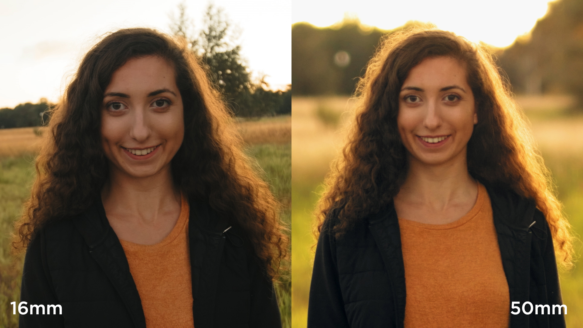
The next note that I have from this article is that it is recommended to use longer lenses to achieve the shallower depth of field. But this is where I'll divert on my own path. In the article, they recommend using a 85mm lens or a 70 to 200mm lens. In the article they specifically mention "not a 50mm or a 35mm lens." Which at first, had me worried. Because that was the type of lens that I would be working with. (A 50mm cannon lens). But then I realized that the only setback that I would face is that I would just have to be a lot closer to my subject rather than if I was using a 85mm lens. Which shouldn't be a problem.

What brought my confidence up was the next step in this article. Which mentioned having a wider aperture lens is such a benefit compared to other lenses. They specifically mentioned using a 50mm f/1.8 and said it was "optically impressive, and capable of beautiful background blur." 

In the next blog, I will continue this research and go further into depth on Bokeh and achieving that blurry / out of focus background.

Bokeh


What Bokeh is, is the specific region of the photo that is out of focus or seen as "blurry."
For example:
Link for image: https://www.diyphotography.net/wp-content/uploads/2020/12/bokeh-1.jpg
Now how this looks in food photography:


Cover Inspiration

I've always had a general idea of what I wanted to do as my cover photo. The only thing about it that is challenging is the execution of the photo. For me I'm not worried about the extra things like masthead or subtitles, or other things that may go on top of the cover over the image. To me, I'm most worried about getting the shot to look good, whether it be because of the focus pull of the shot, the lighting or the framing. This blog will be short but for the next few I will be going into depth specifically on those 3 things so I can master them before my shoot which is going to be tomorrow. 


My Inspiration for my Cover


I really love this concept, mainly because of the shallow depth of field that this image has. And I hope that mine will be as similar as possible photography wise so that my cover photo looks just as good if not better. 


Color Research (Masthead)

For the colors that I want to include, I mainly want to stick to colors related to hunger and food. After doing some research, I found that the colors that stimulate the appetite are warmer colors such as:

  • Red
  • Orange
  • Yellow

Red

Red was found to be the most stimulating color to invoke your appetite. Scientifically, the body's biological response to the color red increases your heart rate and blood pressure. Which stimulates your metabolism causing you to want to eat more.

Orange

The color orange is used to grab your attention. Orange is seen as an exciting and attention grabbing color which is believed to encourage socialization, which is linked to be a indirect simulant for your appetite. Orange is seen as an informal color which can make a healthier dish look more appealing to the average consumer and encourage balanced eating.

Yellow

Studies show that the color yellow is associated with happiness and energy because of its direct correlation to sunlight. This feeling could cause people to overeat on specific food without being to worried about the food nutritional value of said food. This combined with orange can increase the impact that warmer colors have in boosting your appetite and mood. 

Sources for Color Research: https://www.escoffieronline.com/how-color-affects-your-appetite/

How I Want to Implement These Colors

As seen in previous blogs, I want to use the colors Orange and Yellow in my masthead. Mainly because of the attention grabbing power they possess. 
Masthead:
This was my initial sketch, I plan on keeping the design the same, but colors wise, I am going to pick which specific yellow and orange I want to use using the website coolors.co.


After doing some research on coolors.co to figure out which colors I want to use for my Masthead, I have finalized on these specific ones.


Now no I did not do specific research on each shade of Yellow to Orange but honestly, I like the way it blends visual and think it matches my sketch very well.


Table of Contents (Final)

So now came the time to start creating this masterpiece. I first started with creating a background for the table of contents. I added a lig...